
Build dashboard with Excel
If you've ever spent an afternoon wiring up charts, pivot tables, and conditional formatting just to get a status view you'll have to rebuild next month, Microsoft's newest Excel feature is aimed squarely at you.
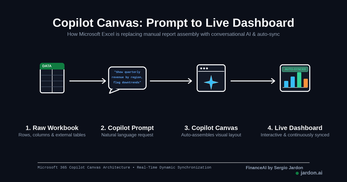
It's called Copilot Canvas, and Microsoft describes it as a Copilot-generated view that turns your workbook data into "a polished, interactive view of key visualizations, metrics, and insights." In practice, that means you stop building the dashboard by hand and start describing it instead.
How it works
Open a workbook with the data you care about, and chat with Copilot the way you would ask a colleague, think something like "create a dashboard showing quarterly revenue by region and flag anything trending down." Copilot picks the charts, lays out the key metrics, and assembles the view. The bigger shift is that the Canvas stays synced: when the underlying data changes, whether from a manual edit or a refreshed external data source, the dashboard updates itself rather than sitting there as a stale snapshot.
It's still rolling out gradually, so you may not see it in your ribbon yet . If you build the same recurring report every week or month, it's worth keeping an eye out: this is exactly the kind of repetitive spreadsheet work AI features are best at performing.
References
Windows Latest. (2026, September 5). Microsoft is adding an AI-powered Canvas to Excel that turns workbook data into interactive dashboards. Windows Latest. https://www.windowslatest.com/2026/09/05/microsoft-is-adding-an-ai-powered-canvas-to-excel-that-turns-workbook-data-into-interactive-dashboards/